Design Thumbnails Using Imagemagick
 April 25, 2015
by
David T. Allen
April 25, 2015
by
David T. Allen
To make the site more appealing, I started playing with imagemagick to generate eye-catching thumbnails. Our site still has a long way to go, but I prefer to make small improvements over time to holding up our site (and our writing) for a massive redesign.
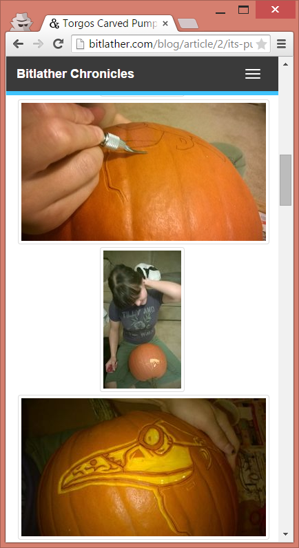
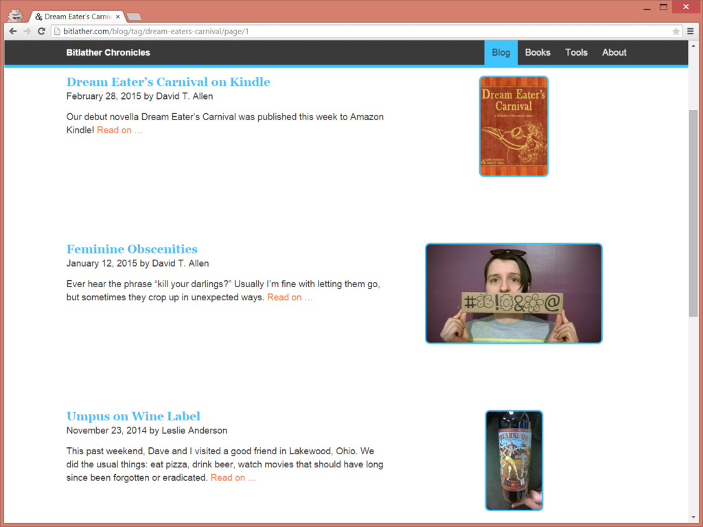
The blue borders around thumbnails were an indicator that you can click the image to go to the article, but it feels heavy. It also clashes against images with certain palettes.


Additionally, thumbnails in our blog articles had the default bootstrap border around them, which felt inconsistent with the rest of the site.
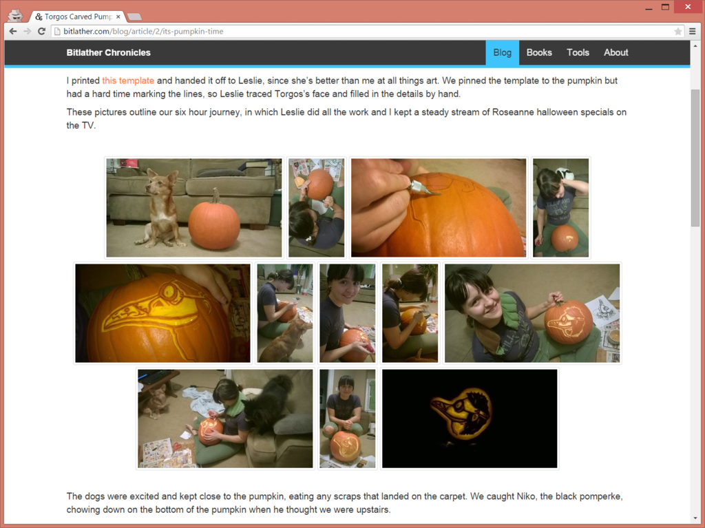
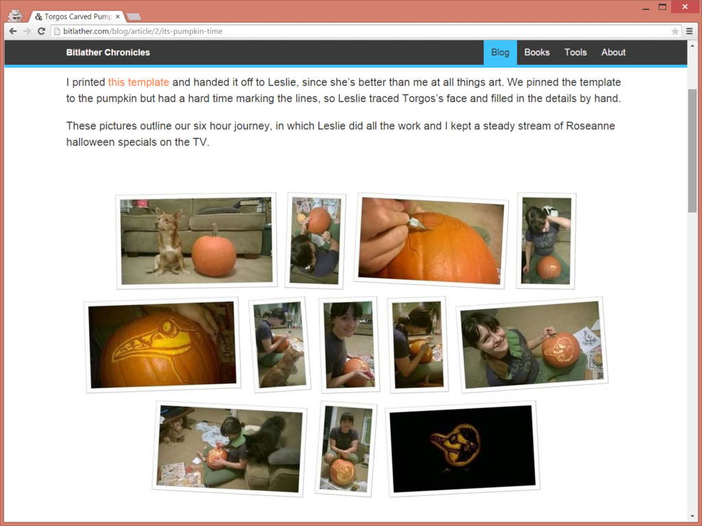
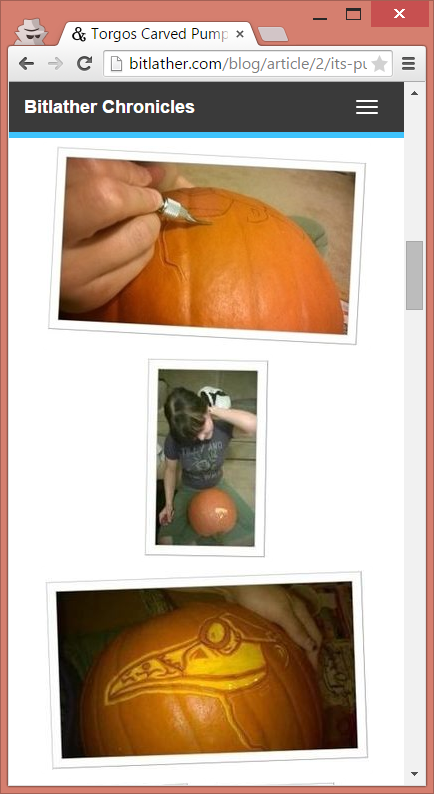
Here’s a few more before-and-afters:
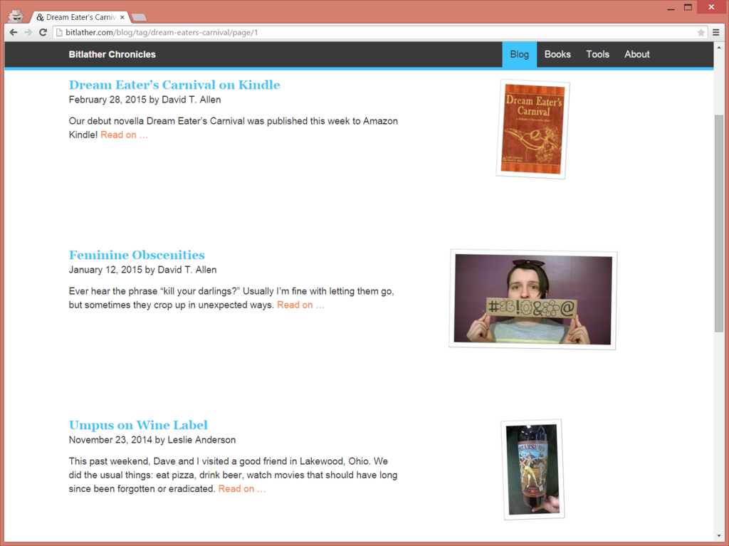
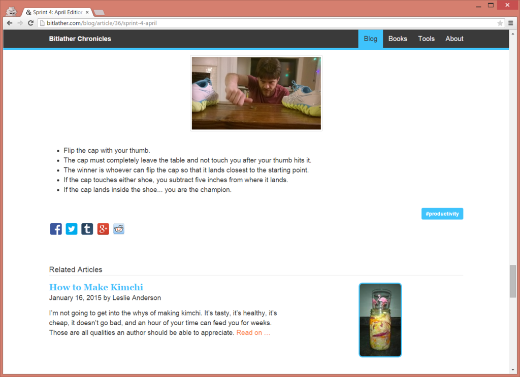
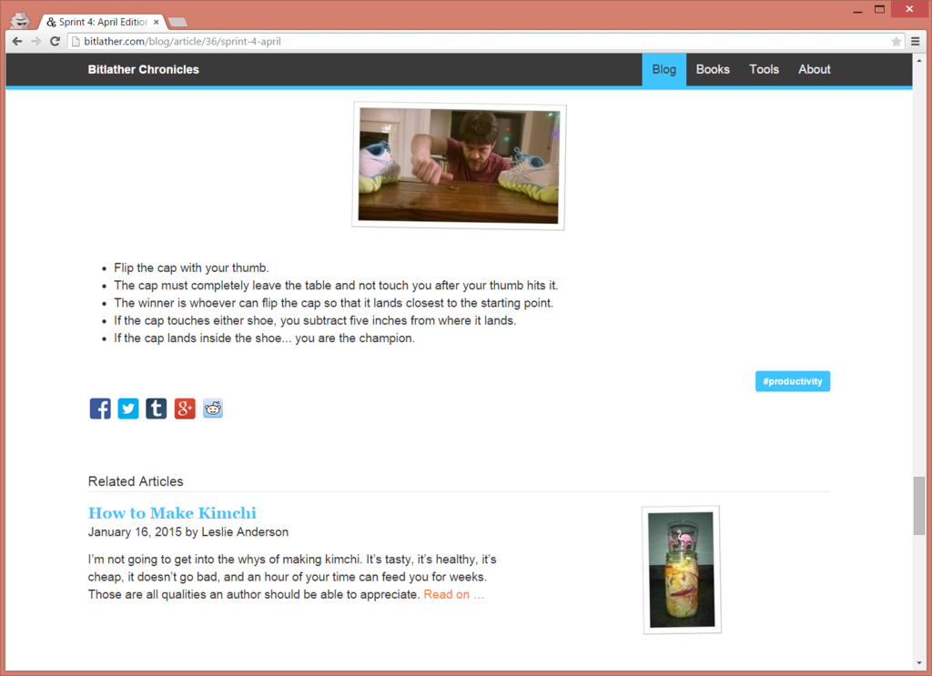

I wrote a script that uses a few basic imagemagick commands to resize, tilt, and add a frame:
convert $BigFileName -resize x200 $FileName

convert $FileName -background $Color -gravity SouthEast -extent {$Width}x{$Height} $FileName

convert $FileName -bordercolor $Color -border $BorderSize $FileName $FileName

convert $FileName -rotate $Degrees $FileName
The script automatically generates the thumbnails for new articles, so it’s hands-off. Remember, image thumbnails should be a smaller image – if you just scale down the picture using HTML or CSS then your page will load slowly.
Eventually, I’d like to move toward a more steampunk aesthetic, but that will come in time.