Blog Design Tweaks
 February 11, 2015
by
David T. Allen
February 11, 2015
by
David T. Allen
I’m not a designer. Not even close. So when I built this site, I just used bootstrap, kept it simple, and focused on functionality over aesthetic. But it’s time to make a few changes. I’m not sure how much these changes will impact viewers, but I hope sharing this information will help you scrutinize your own blog.


First, the root page, www.bitlather.com, now shows the blog instead of books. I think seeing a list of blog articles is a better first impression. If a visitor came for the books, it’s easy to get there. Also, we advertise the most recent book at the top of the blog page.

Speaking of that advertisement, I changed the button so it fits in better with the design. I think the big blue button was jarring.
The site’s title, Bitlather Chronicles, is now bolder. I might change my mind on that one and put it back.
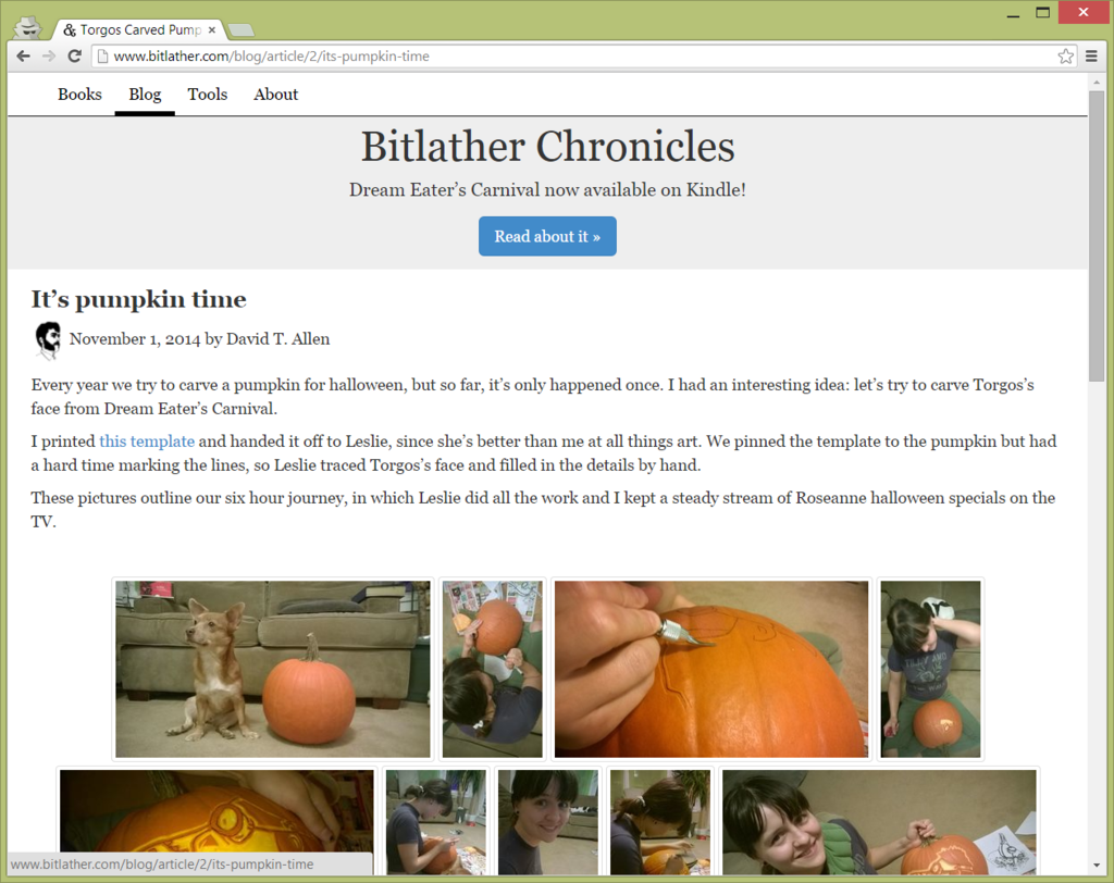
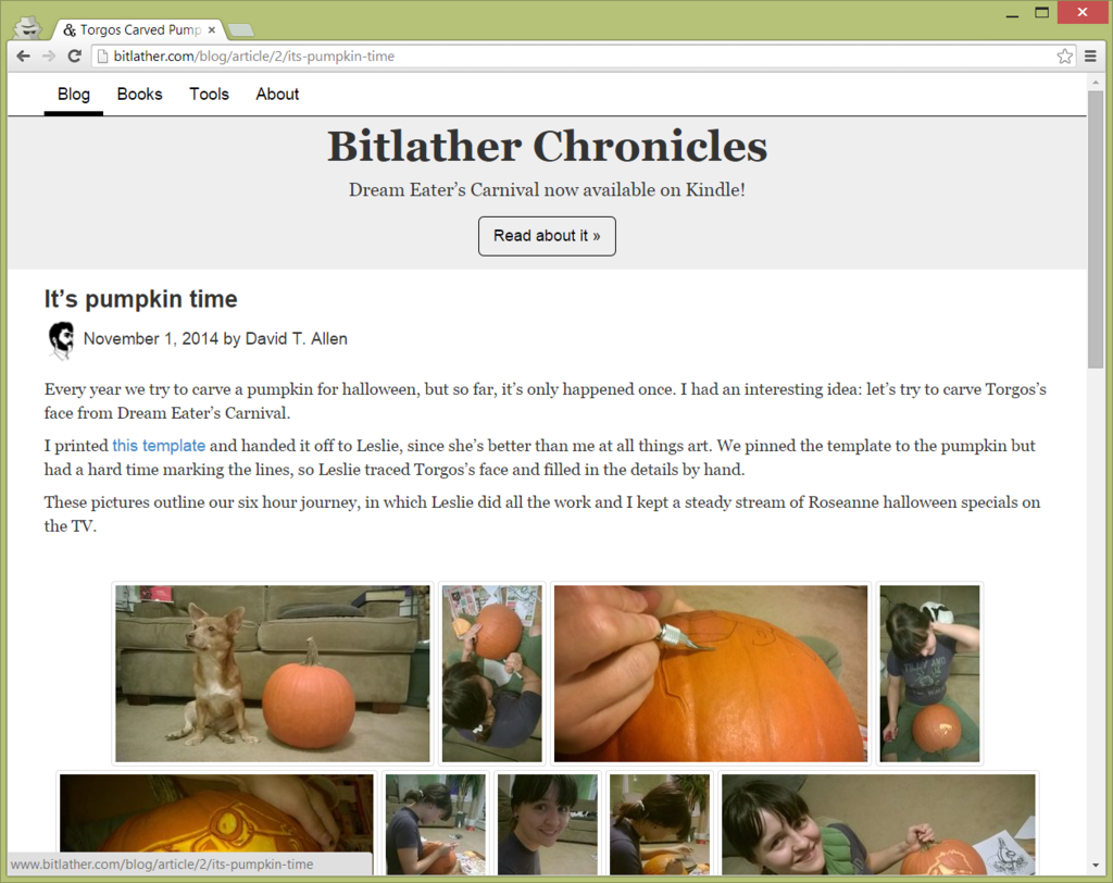
Header tags, blog dates, and links are now a sans serif font so they pop a bit more. I noticed other blogs switch between using a serif and sans-serif font for headers and content. Looking back, I think using a serif font for everything looked messy.
Speaking of messy, I removed the author icons when listing blog articles. They felt like clutter. They also didn’t work well on cell phone screens.
I also decided to switch to title case in header tags.
The currently selected filter in lists of blog articles persists. Before it went away, and I think that made the list a bit jarring when switching between tags.
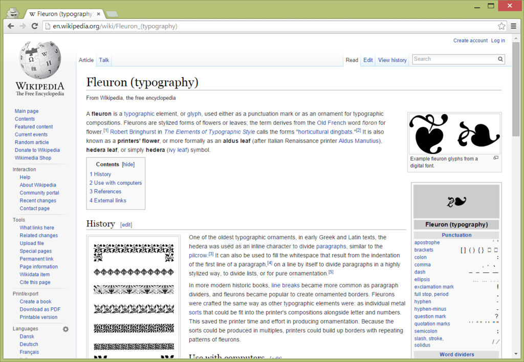

I’m considering changing it so headers have serifs and content doesn’t, since small sans-serif fonts seem clearer than small serif fonts. That’s how wikipedia does it. I’m not trying to astound the world with my design skills, and I assume wikipedia has thought hard about their fonts, so borrowing from them isn’t a bad idea.