Blog Redesign #2
 February 1, 2016
by
David T. Allen
February 1, 2016
by
David T. Allen
I believe in iterations. I love building a bare-bones product, using it, finding its faults, then making only the most valuable modifications. Time is short, after all. This article highlights some of the changes I made to the blog’s design last September.
Keep in mind that the latest design is just another iteration.
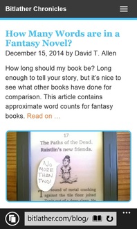
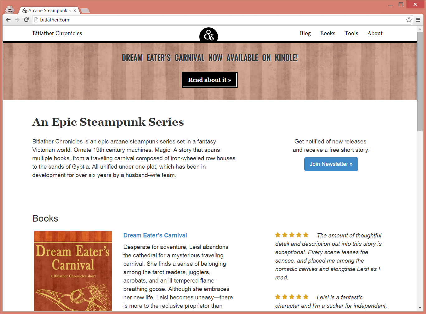
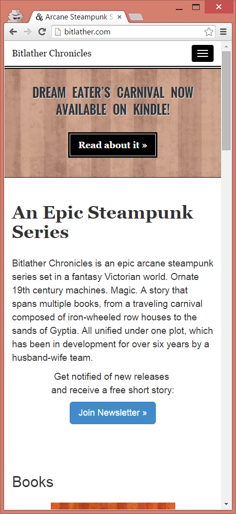
Comparing New and Old
Let’s start with the landing page, which makes better use of space now by including excerpts from book reviews:

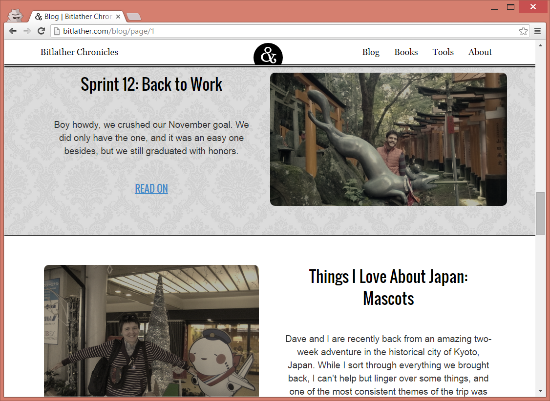
The following is a redesign of the blog page, which was probably the biggest change:
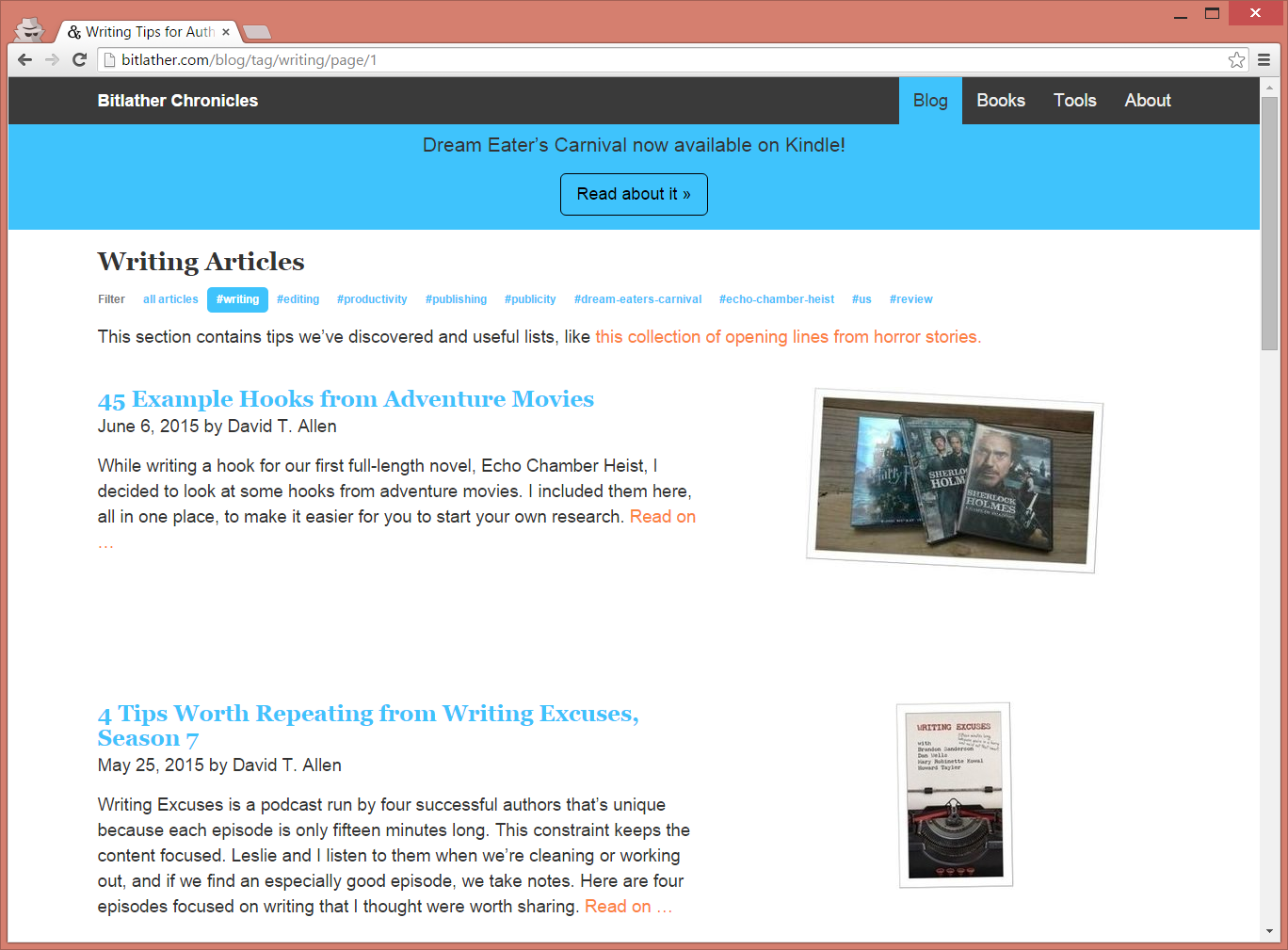
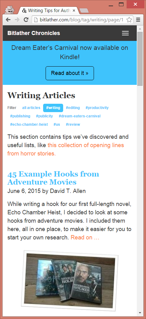


- Larger links are easier to touch on mobile devices.
- Bigger thumbnails are more appealing.
- Taller titles make the article stand out more.
- Increased padding feels less cluttered.
- Removing dates increases room for content.
- Fewer colors for non-tag links makes it easier to focus.
- Titles are still clickable, even though they’re just black text, but the read on link has a typical style to make the actionable item pop.
Still, I have some padding issues here I need to fix.
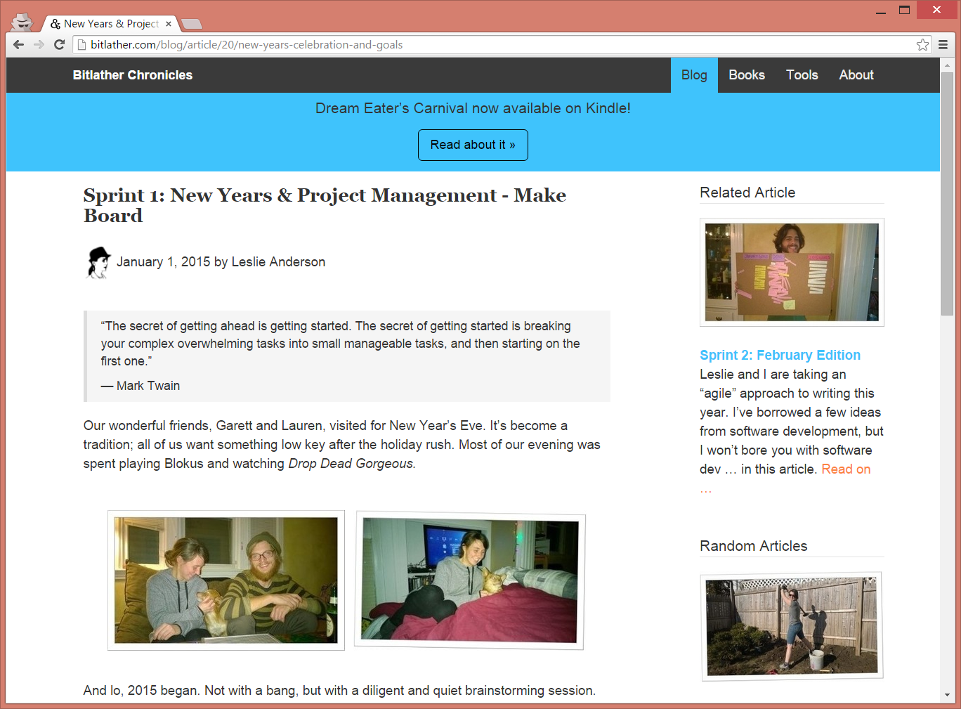
The thumbnails also alternate, right to left, and every other article has a low contrast damask wallpaper behind it:
Not much was changed with articles. I’d like to revisit font, line-spacing, paragraph padding, and other styling some day. I’m still not satisfied with how the right side bar looks, either.

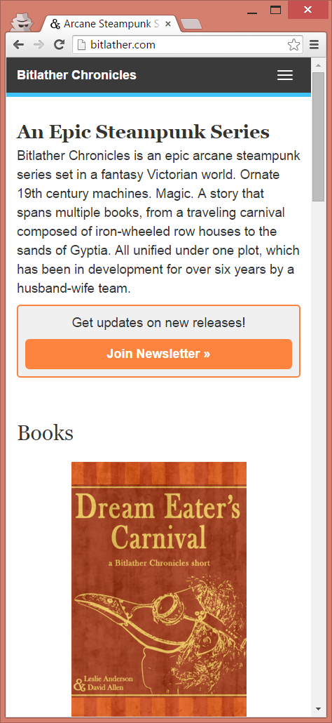
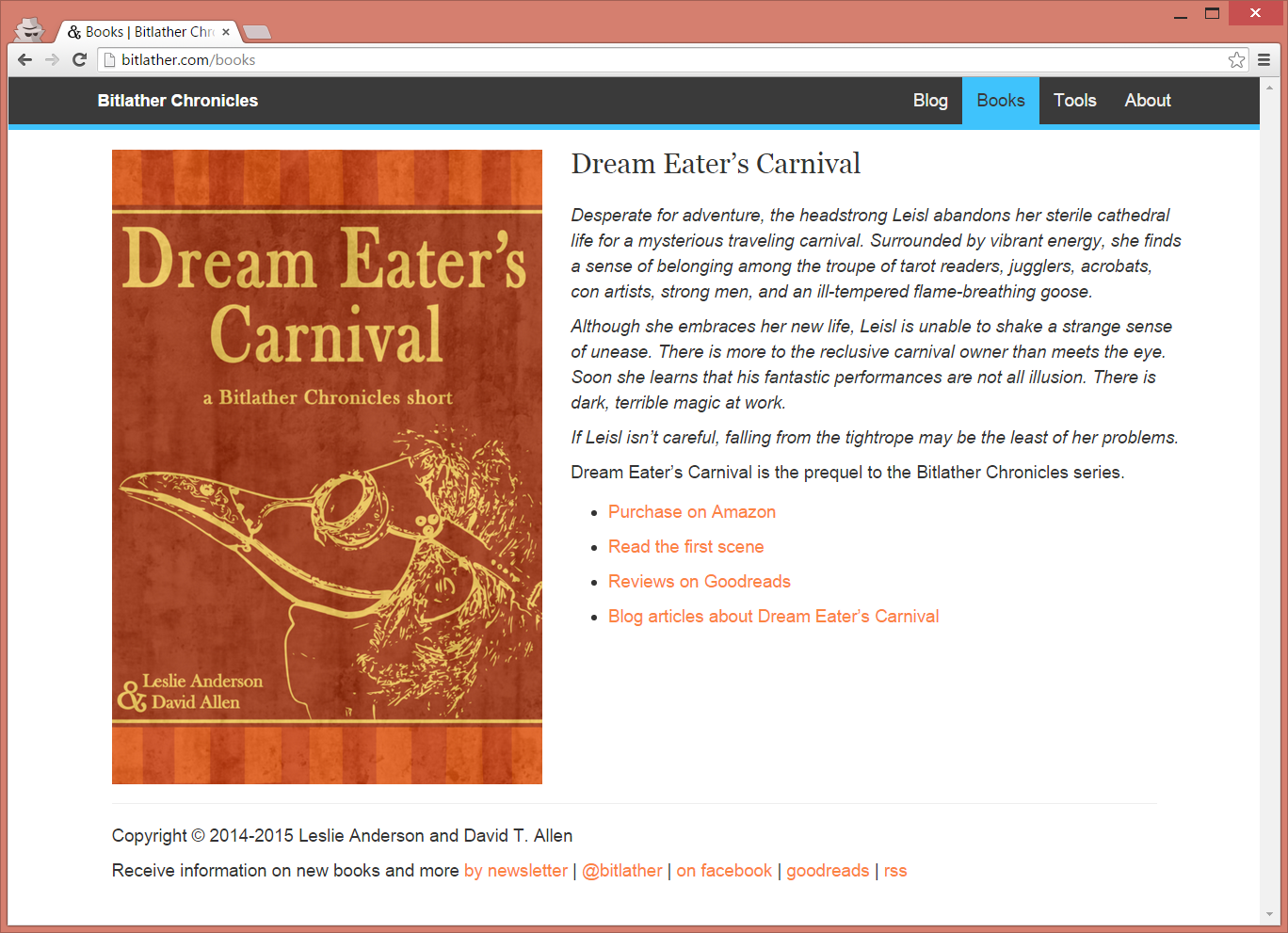
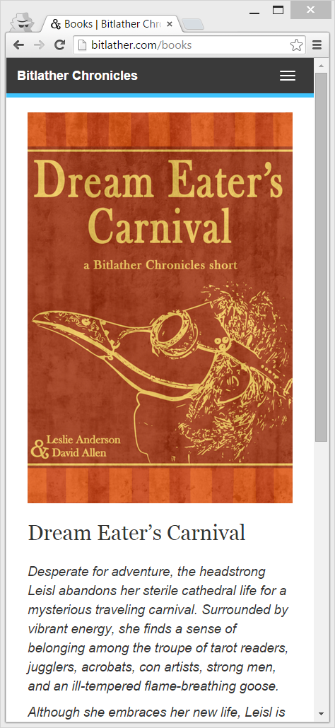
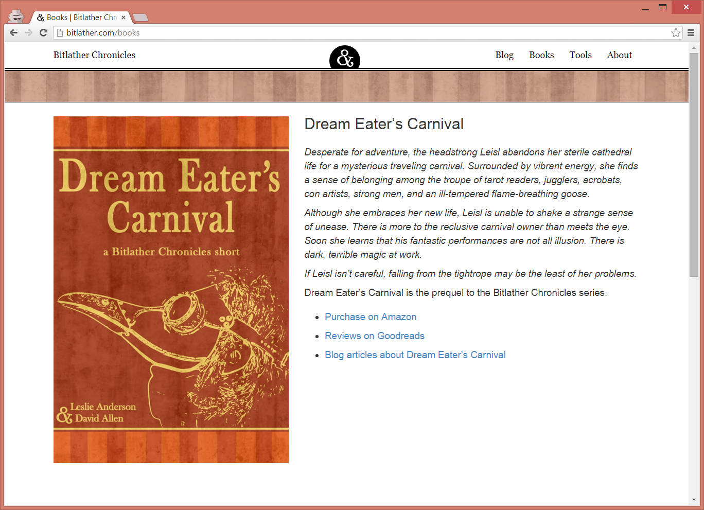
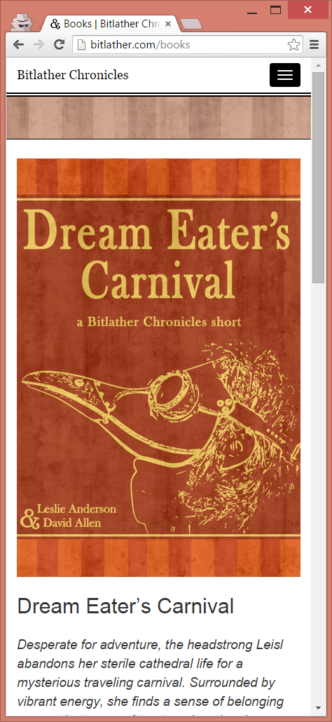
The books page also was barely changed:
Iterations on Blog’s Front Page
The original design was released around October 2014. It was incredibly primitive, but fairly clean:
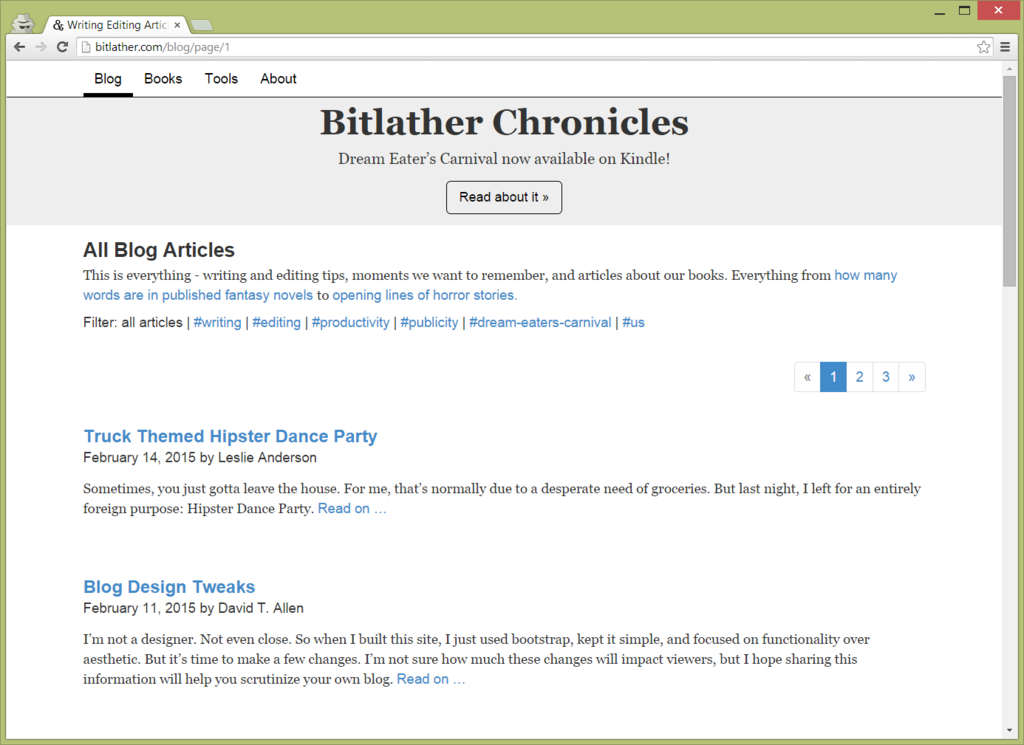
I didn’t care that it looked bad because we didn’t have enough content to get visitors, anyway. All I wanted was something that could evolve.
It only took four months for me to get bored. In February 2015, I added some color and put images on the blog page:
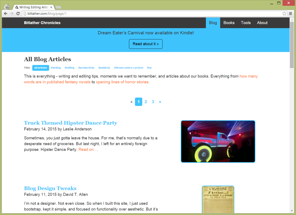
It was an improvement, but the design didn’t match the aesthetic of our books.
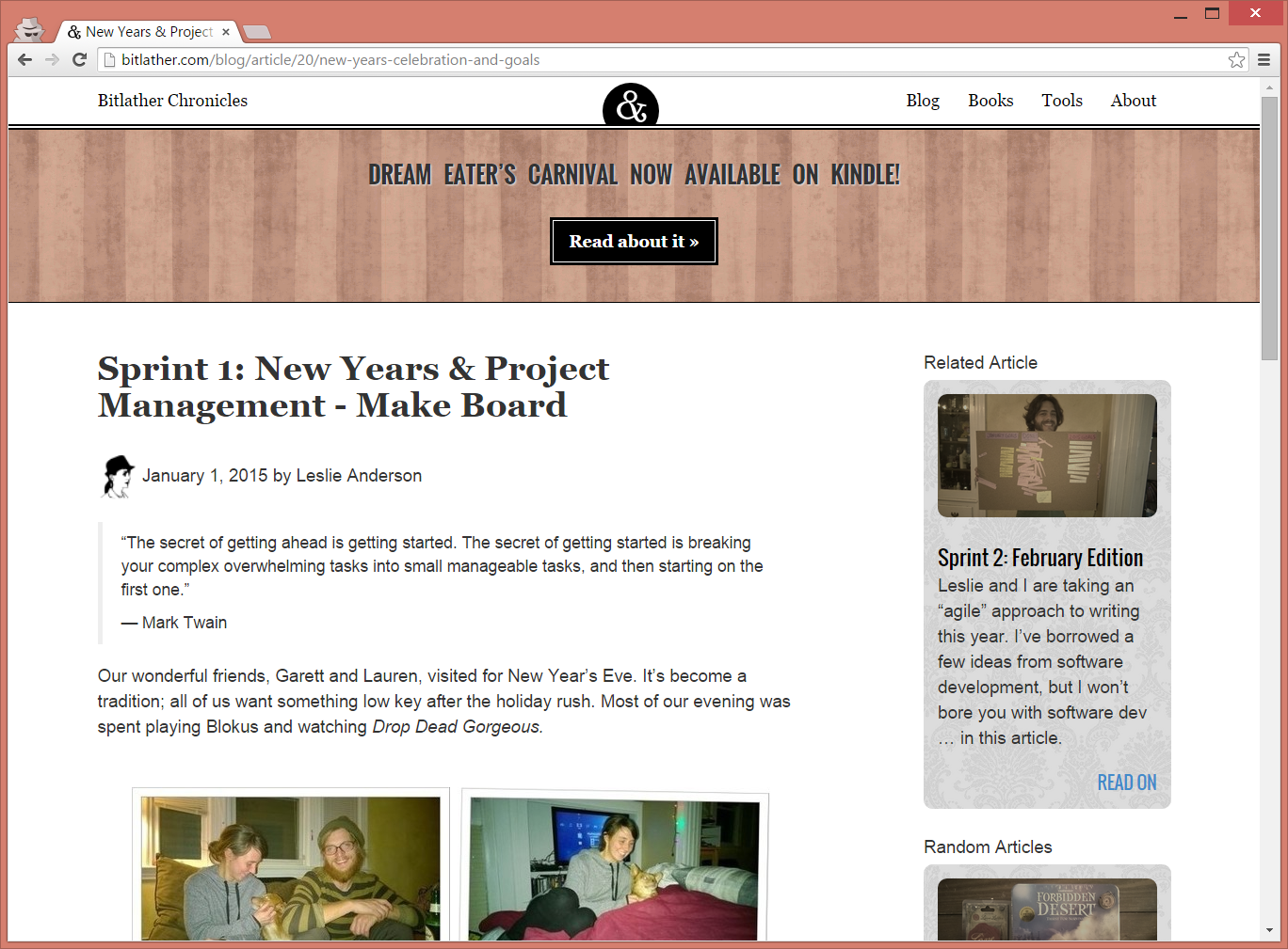
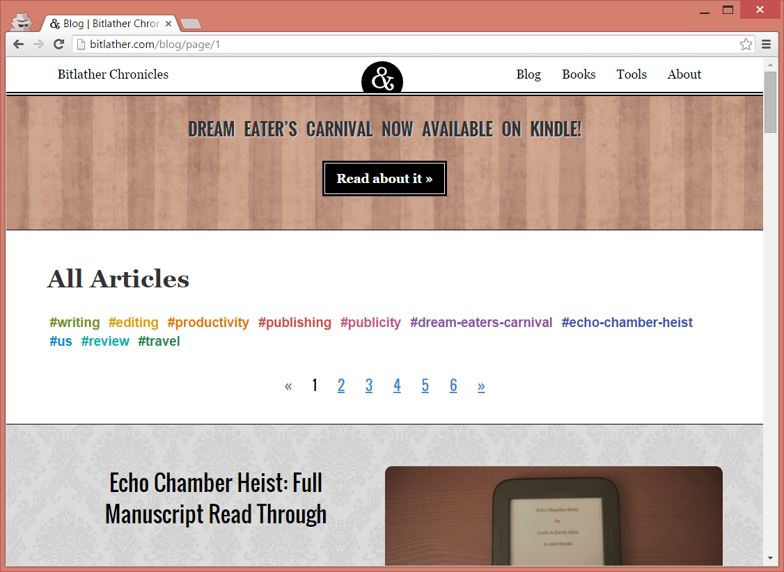
One night, I sketched a new design that still used the same basic layout but added colors and images. I wanted a Victorian vibe, but without the baroque details that were beyond my design abilities and would complicate mobile development. I aimed for a modern-Victorian feel, with a focus on white space.
The banner now uses a textured image, instead of a solid color, and the images next to blog articles are even more prominent:
History of my Decisions
I decided to do everything the hard way and build my own blog from scratch. Normally, I don’t recommend this, even for developers, since it can be a waste of time, but I did some research and found that normal blog resources just didn’t meet my expectations.
I started this blog in October, 2014, with only a few requirements:
- Works on mobile devices
- Has a simple blog, with tags and links to related articles
- Has a list of books
- No database backups required
- Easy to change
I had some experience with WordPress but didn’t like how difficult it was to build my own plugins and layouts. Using WordPress would also mean I’d have to do my own database backups. (However, I think the WordPress commenting system is top notch.)
Warning: it’s about to get a little technical
I’m not a designer, not even close, so I built a minimal design focused on content. I used Bootstrap with a mobile-first mind set, where every page’s layout was designed for a cell phone first, then expanded to work with tablets and desktops.
I was learning (and loving) Laravel at the time, so I decided to give it a shot. All of our articles are stored as database migrations, which means the content is safely stored in a file with the rest of the site.
Essentially, I don’t have to backup the database—if my server fails, I spin up a new one, deploy my code, and run a script to load all of my articles. On the downside, it means Leslie can’t just log in and post articles any time she wants. On another plus side, we use Parsedown, which means neither of us has to touch a WYSIWYG editor.
I’m sure a designer could do a much better job, but I’m not disappointed with how things look … at least, not yet.